So how did you go? Are there lots of red artworks out there? I hope so 😀
To submit your work to the challenge, either upload your art to the brand new Spectrum Square Flickr group, or add a link in the comments section of this post. Then we can all bask in the glory of last week’s colour 😀
For reference I have made a page on this website devoted specifically to Spectrum Square so we know where the guidelines are. You can find it in the menu bar under ‘Challenge Directory’. You can also find the colour wheel there for colour reference.
And now I almost forgot to add my spectrum squares. Yes, plural, I did more than one 😀 Though none of them are any great artistic work.
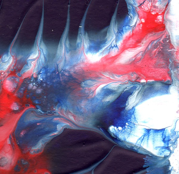
First up I played with my acrylics again. Never did I realise just how difficult this colour combination of dark red, orange and violet could be. I will admit to using some blue-violet paint as I didn’t have a good violet on hand (my purple is just ergh…I’m asking for some new acrylics for my birthday next week :D) Not much came out very well. I mucked around with flow medium and a weird effect that happens when I add one particular brand of paint to another. Something chemically weird happens and the paint disperses interestingly.
I did several of these, some with orange and some without. This was probably the best of them. One thing that I found interesting, though, is once I had scanned them into the computer at a decent resolution, I can then zoom in on interesting sections of the work and enlarge them, highlighting the effects of the mixing paints – something I’m really interested in at the moment.
From one of the other pieces I created this:
Finding beauty in the small is another of my investigation areas. You’ll hear me babbling about that in the future, I’m sure.
I started a watercolour pencil piece, but my children didn’t let me finish it on time (it is hardly started, it needs a lot of work).
On a whim, I dug out my soft pastels on Monday and, arranging my sticks in colour order, I played with the colours some more.
First up, a straight blend from one end of the spectrum to the other (well, a little zig-zaggy).
From that I really liked the bottom right colour shift between red – orange – white, so I played with that colour combo for a while and came up with this unfinished piece (my youngest daughter decided to stay up half the night last night, so I didn’t get to finish it 🙁 If I do in the future I will post it to my blog).
I was really enjoying the texture in this one. I’ve tentatively named it ‘Reverse’ as that is the challenge for Illustration Friday this week, but I doubt I will get it finished in time to submit it for that as well.
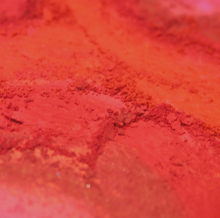
I did some close up/in progress shots of these two pieces, and the resulting photos have kinda evolved into individual spectrum squares themselves.
These all print at a workable size and I can use them for backgrounds for other pieces of art, like colour zentangles. Another clear case of beauty in the small.
That is all I managed to do this week. I found that instead of trying to draw something, the nature of the challenge let me simply explore the colours themselves. It was fun and freeing. And proof I need to visit the art shop to buy more paints! (Not that I needed an excuse :D)
Now, onto this week’s colour. This week the main colour is
Electric Lime
(#CCFF00)
 |
Almost the complete opposite of last week’s, though not intentionally.
Your supporting colours are Electric Lime -> Yellow and Electric Lime -> Green. A less fancy name for this colour would be yellow-green, so basically you have yellow, yellow-green and green this week. The focus of the work being yellow-green 😀
I’m eager to see what everyone has come up with ::rubs hands together gleefully::
Nutty
(this is fun)
Edit: And I just noticed, while uploading these images to Flickr, that some of those squares don’t really meet the criteria (the macro ones). Oops. I will say here that if you create something inspired by this challenge that doesn’t really meet the criteria, submit it anyway, I’d rather see art than the empty spot it could have occupied if a concern for relevency got in the way.


Comments
3 responses to “Spectrum Square – Dark Red results and a new colour”
I had a great time playing with Dark Red – one of my efforts is posted on the Flickr group. I’m still finishing up a couple, but looking forward to seeing what Electric Lime brings!
Thanks for joining in 😀 It is great to see your stuff up there.
Nutty
(feeling a little electric green)
[…] Peel.” I’m having fun with these, looking only at a limited group of colors. Electric Lime was done in […]